
Massimo Vignelli died on May 27th. For certain people—including design enthusiasts, collectors of maps, and veteran riders of the New York Subway—his is not a new name. In the 1970s, Vignelli named the Washington Metro and generated much of its signage. In the same era he did similar work in New York; the two most ridden metro systems in the United States thus carry elements of his design work, and will for the foreseeable future.
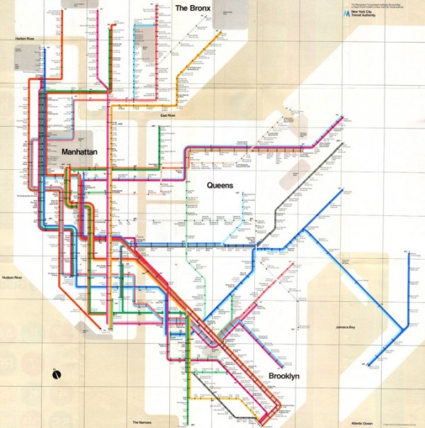
What is likely Vignelli’s most famous achievement, however, has disappeared from the system’s walls and display cases. This is his 1972 map of the New York Subway, which made travel on its labyrinthine system look like a tidy and organized affair. In the age of “Ford to City: Drop Dead,” Vignelli’s map transformed the subway’s lifelike twists and kinks into design work that was abstract but not austere.
For most of the 1970s, then, straphangers saw their system as a web of colored lines, arranged mostly at right angles, stretching from the West Bronx to the Rockaways. Vignelli made few concessions to geographical conventions. In his representation of New York, water was beige, parks a dark gray, and Staten Island was nowhere to be found.
Whether this sounds sleek and colorful or grimly abstract, it seems not to have been well-received. After all, longtime riders who knew the system hodologically—as a series of stops arranged sequentially across lines—preferred to think of themselves as under neighborhoods and landscapes they could readily imagine, not trapped in an abstract web. And tourists in “Fun City” wanted to see Central Park as a green rectangle instead of as a gray square, and to see Midtown as a traversed by a grid of single lines rather than the rainbows of triple and quadruple lines that Vignelli’s schematic offered up.
Yet Vignelli’s map still hangs on the walls of connoisseurs of Modernism, many of whom are willing to pay good money for a copy on eBay. Everywhere else, the MTA’s maps have been geographically accurate and chromatically unchallenging since 1979, that reactionary year that also brought the world Margaret Thatcher, the Ayatollah Khomeini, and Disco Demolition Night.
Vignelli’s map raises certain questions, not only for connoisseurs and cartographers considering his legacy but for everyone else. Should a bend in the tracks register as a squiggle on a wall? Which spatial representations resonate with how we occupy and move through the world?
On the one hand, abstract representations of space like Vignelli’s map might make the viewer imagine that she is lost in an overgrown circuit board, a geometry problem, a modern Arabesque designed to awe without representing life. Maps, after all, are always more than utilitarian schematics; at times they are expressions of faith. We wish to see our subways, shopping malls, freeways, and library stacks as meaning more than abstract objects that fill a certain domain.
On the other hand, we may come to realize that Vignelli was ahead of his time. The New York Subway is not some model train enlarged twenty times, but more a set of notions of time and directionality that link millions of people to the activities that make up their lives: sleep and sex, work and play, stimulation and intoxication. And as we interact with increasingly abstract technology, with its swipes and pinches, cuts and pastes, the colorful, angular world of the Vignelli map will start to seem less strange, and new maps of every sort may mirror its aesthetic merits without stirring discomfort in newer generations.
Vignelli’s map will, in any case, outlive its creator, even despite its removal from subway walls in 1979. There is, to begin with, the oddly named Weekender map, an online subway diagram that aims to show New Yorkers which stations and lines are impacted by weekend repairs. Designed by Vignelli in his last years, it looks like an update of his subway map, albeit with the Staten Island Railway and a bus to Laguardia added for good measure.
There is no easy answer to the Vignelli Conundrum, but it does serve to refresh the aura of maps: in looking at them, we imagine the spaces they represent and ourselves journeying through them. A passenger who boards in the Bronx and rides to Midtown might ride for decades without getting off at any stop between, but her sense of self, of belonging in a city and in the world, might depend ever so subtly on the map that once guided her. Certainly the Vignelli map is a thing of beauty, and only one part of a long and successful design career. But in speculating on its failure to endure as an official document, we can remind ourselves that maps serve not only to guide, but also to affirm our faith in being in the world.
