
A selection of illustrations from Mr. Horowitz’s portfolio can be found in the slideshow below.
Daniel Horowitz is an illustrator who has become a favorite among publishers and journals. His work has been featured everywhere from The New York Times and Random House, to GQ, The Wall Street Journal, Knopf, and now, The American Reader.
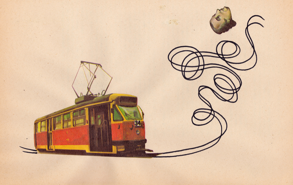
His illustrations resist easy categorization. They are not puns, nor are they what one might term ‘visual metaphors.’ Rather, they employ an associative logic, whereby disparate objects are collaged into impossible, dreamlike images that are nonetheless psychologically cohesive. Through dissonant object pairings (which tempt the viewer’s interpretive faculties), and a Freudian’s fluency in our collective symbolic lexicon, Horowitz makes visible the un-visualizable: Aging, Polish/Ukrainian Relations, Levity.
Earlier this week, the thirty-three-year-old illustrator spoke to The American Reader about growing up on Tex Avery cartoons, working on his collection 365, and trying to design book covers that convince you to crack the spine. —Alyssa Loh
The American Reader: Your illustrations feature the kind of conceptual leaps one finds in those old animated series, like Tom and Jerry or Wile E. Coyote and Road Runner. These were worlds where, say, running along a road made the road’s edges lift off the ground, as though it were a piece of ribbon—and we accept it because the icon for a road is so close to the icon for a piece of ribbon. How would you categorize your works?
Daniel Horowitz: My process is in fact an exercise in free association, of connecting dots. I mine society’s visual heritage, searching for parallels that can be drawn that play on the viewer’s familiarity with any given subject. And the strength of a visual metaphor largely depends on how successful this sort of rearrangement of the human narrative is.
I was raised, or should I say educated, on Tex Avery cartoons. I remember once one of the characters walking in manner that defies gravity, turning to the audience, and saying, “In a cartoon, you can do anything.” Even a child can appreciate the sort of pun of the coyote running off the side of a cliff and, once realizing that he is suspended in air, beginning to fall. In this way, the potential to subvert a commonly held belief or expectation is in some way what I do as an illustrator, when I am successful.
AM: Your work frequently takes advantage of how similar the icons are for highly disparate objects—for example, tree branches and moose antlers. (I am thinking of your illustration for Travels Magazine, in which a flock of birds are nestled in the antlers of a moose—and look entirely natural being there.)
Some of these substitutions seem to invite the viewer to riddle out explanations for them. For instance, a bird with a fountain pen-beak is featured on the cover of Polish novelist Witold Gobrowicz’s Cosmos—a novel that hinges on two men projecting symbolic meaning onto a dead bird (attempting to read the bird, perhaps). Do you intend for your viewer to try to interpret your substitutions?
DH: It is important to note that both the literal and interpretive meaning of a picture is what tells the story. I am counting on the viewer’s familiarity with individual objects to then make sense of the cognitive dissonance.
AM: How has your background influenced your work?
DH: I am privileged to have been born into an artistic family with an Eastern European background. As a child, my exposure to the school of Polish poster design had a tremendous impact on me. Under Soviet occupation, the state commissioned posters by Poland’s leading artists for theater, film, and circus. Interestingly enough, American and other foreign films were screened in communist Poland. However, rather than repurposing the standard posters based on likenesses of the actors, the government commissioned entirely new posters, now legendary for their beauty, sophistication and, above all, individual interpretation.
The poster was less an advertisement than an interpretation of the film. The only criterion was to make it past the censors, resulting in a degree of subtlety shaped by adversity. In fact, I have a hard time finding another example in history in which the lines between fine art, graphic design and illustration are so indiscernible. My young impressionable mind was deeply affected by exposure to such posters by masters like Francziszek Starowieyski, Henryk Tomaszewski, Wojtech Fangor, and Andrzej Klimowski.
Over time, I developed a longing to create similar images of my own. After graduating from the Art Center College of Design, I had the great fortune of spending several years teaching and working alongside some of these masters in Warsaw.
AM: The style of your illustrations is tremendously varied. While you have a sizable collection of idea-o-grams (icons expressing a concept, i.e. Aging, Riding the Financial Wave), in other illustrations, the meaning remains elusive. One of my favorite pieces features an immense silhouetted woman at rest in a formal bedroom, while multicolored steaks shoot from her neck. I cannot make head or tails of it, yet I am entirely enthralled.
With your pieces like this—less self-contained, perhaps, than your illustrations that accompany articles—do you have a distillable meaning in mind while you create it, or is your process for these works more associative or subconscious?
DH: Whether I am making an image for a client or creating one for myself, I am still looking for the same sorts of associations. I attempt to read into a story past its surface to uncover an underlying narrative. It is almost as if the images are latent in the article and I just need to tune into the right frequency to find them.
I often work digitally but the same goes for the painting on found ephemera that you describe; I tune into an inherent narrative that I imagine exists.
AM: How did you create your collection 365 (©The Invisible Dog, 2012)?
DH: Starting in the beginning of 2011, I committed to creating a completed artwork every day for an entire year to see how far and where a practice of free association could really take me. I published a book documenting the journey and titled it 365.
AM: Your illustrations are often featured on book covers or alongside articles. Why do you think your work is so amenable to being paired with text?
DH: I guess I feel that, over the years, I have honed in on an almost scientifically deductive method for deciphering the underlying meaning of a given text and then in a way translating it into visual language. At best I can only hope to convey the essence of an entire story through a single image.
I suppose what is most relevant is that we are visual and spatial creatures first, whereas reading and interpreting language is learned and developed over a lifetime. I do “read” books by the cover, and I am as obsessed with reading as with how words can be packaged. Just as a teacher can inspire a student to learn, ultimately an illustration should inspire one to read. I am extremely glad and grateful that people see it fitting to pair my artistic interpretations with text, and I hope that this trend continues.
Daniel Horowitz is currently at work on an online project illustrating every page of The Master and Margarita by Mikhail Bulgakov: http://drawingdujour.tumblr.com.